
UI and UX design guide
A complete guide to UI and UX design with FuturByte
What a UAE business should know before commissioning interface design: how we research, structure, prototype, test and hand over designs that people find easy to use.
What UI and UX design covers
User experience design, usually shortened to UX, is the work of deciding how a digital product should behave so people can achieve what they came to do. User interface design, or UI, is the visual layer on top: layout, typography, colour, controls and motion. The two depend on each other, and a product only feels effortless when both are done well.
At FuturByte, we design websites, mobile apps, web applications, dashboards and internal tools. Our job is to reduce the effort it takes for someone to complete a task, whether that is booking an appointment, comparing properties, approving an invoice or checking an order. This guide explains how we approach that work and what you receive at each stage.
Who we design for
Our design clients range from startups shaping a first product to large organisations redesigning systems used by thousands of staff or customers. We work with companies in real estate, finance, healthcare, education, logistics, retail, hospitality and government services, where clarity and trust matter as much as appearance.
Some clients come to us with an idea and no screens. Others have a live product that works technically but frustrates users, generates support calls or loses people halfway through a sign up. In both cases the starting point is the same: understanding who uses the product, what they are trying to do and what currently gets in their way. Design starts only once those answers are reasonably clear.
Research before design
We begin by learning about your users and your business. That can include interviews with customers and staff, reviews of support tickets and sales objections, analysis of existing analytics and a look at how competitors handle the same tasks. Research does not need to be long or expensive to be useful, but skipping it usually leads to costly guesswork.
The findings are turned into practical tools: short user profiles that describe real needs and behaviours, journey maps that show each step a person takes and where they struggle, and a prioritised list of problems to solve. These outputs keep the whole team focused on evidence rather than personal preferences when design decisions get difficult.
Information architecture
Before drawing any screens we organise the content and features. Information architecture decides what goes where, what things are called and how people move between them. Poor structure is one of the most common reasons users get lost, even in products that look polished on the surface.
We use techniques such as card sorting and tree testing to check that labels and groupings make sense to real users, not just to the people who built the business. The result is a sitemap or app map, navigation model and naming conventions that the rest of the design is built upon, and which developers can reference throughout the build.
Wireframes and user flows
Wireframes are simple layouts that show what each screen contains and how elements are prioritised, without the distraction of colour or imagery. We design them for the key journeys first, such as onboarding, searching, checking out or submitting a request, and map the flows that connect one screen to the next.
Working at this level makes it quick and inexpensive to change direction. Stakeholders can discuss what a screen should do before debating how it should look, and developers can flag technical concerns early. We review wireframes with you in short sessions and adjust them until the structure and flow feel right.
Prototypes you can click through
A static image can only show so much. We turn wireframes and designs into interactive prototypes in Figma that behave like the real product, so you and your users can tap, scroll, fill in forms and move between screens. Prototypes reveal confusing steps and missing states far more reliably than a slide presentation.
Prototypes are also useful beyond design reviews. Founders use them to explain a product to investors, sales teams use them to gather early customer reactions and developers use them to understand interactions precisely. Building a prototype before writing code is one of the most effective ways to reduce the risk of building the wrong thing.
Usability testing
We test designs with people who represent your real users, asking them to complete specific tasks while we observe where they hesitate, misunderstand or give up. Even a handful of sessions typically uncovers the most serious problems, and watching a real person struggle settles internal debates quickly.
Testing can happen in person in Dubai or remotely across the region, in English or Arabic depending on your audience. After each round we share a short report with clear findings, video highlights where useful and recommended changes in priority order. We then update the designs and, for important journeys, test again to confirm the fixes work.
Visual design and interface detail
Once the structure is proven, we design the full interface. Typography, colour, spacing, imagery, icons and motion are chosen to fit your brand and to make the product clear and pleasant to use. Visual hierarchy guides the eye to what matters most on every screen, so users always know what to do next.
We design every state a screen can be in, not just the ideal one. That includes empty states, loading, errors, success messages, long names, missing data and permission limits. These details are often overlooked, yet they shape how reliable a product feels when real data and real people start using it every day. Thoughtful error messages, in particular, turn a moment of frustration into a clear next step.
Design systems that scale
For products that will grow, we build a design system: a shared library of components such as buttons, form fields, cards, tables, navigation and modals, each with defined behaviour and usage rules. Designers assemble new screens from these parts, and developers build matching coded components once and reuse them everywhere.
A design system makes a product more consistent, faster to extend and easier to maintain. It also helps when several teams or suppliers work on the same product, because everyone draws from the same source. We document the system clearly so your team can keep using it long after our engagement ends.
Designing for Arabic and right to left
Many products in the UAE must work equally well in English and Arabic. Right to left design is not simply a mirrored copy of the English layout. Navigation, icons with direction, number formats, charts, form alignment and text length all need deliberate decisions to feel natural for Arabic readers.
We design both language versions together, using Arabic typefaces that are legible on screens and pairing them carefully with Latin fonts. We test with Arabic speaking users where the audience warrants it. Planning bilingual support from the start costs far less than retrofitting it after a product has already been designed and built in one language.
Accessibility built in
An accessible product works for people with visual, motor, hearing or cognitive differences, and it usually works better for everyone else too. We design to recognised accessibility guidelines, covering colour contrast, text size, touch target size, focus order, clear labels and alternatives to colour alone for conveying meaning.
We annotate designs with accessibility notes so developers know how screen readers should announce elements and how keyboard navigation should behave. Accessibility is far easier to achieve when it is considered at the design stage rather than tested at the end, when fixing problems can mean reworking whole screens.
Designing for mobile first
In the UAE a large share of people reach websites and services on a phone, often while moving between meetings or on the way home. We design for small screens first, then adapt layouts for tablets and desktops, so the most important content and actions are never buried.
For native mobile apps we follow the conventions of iOS and Android, so the product feels familiar on each platform while still carrying your brand. We consider thumb reach, gesture behaviour, notifications, offline states and the moments when a user is distracted. Small decisions in these areas make a noticeable difference to everyday use.
Handover to developers
Good design can be lost in translation if handover is weak. We deliver organised Figma files with clearly named components, responsive behaviour specifications, interaction notes, exported assets and design tokens for colours, spacing and typography that developers can plug straight into code.
We stay involved during development, answering questions, reviewing builds and checking that the implemented product matches the agreed design. Because our own development team builds websites and apps, we understand what is practical to build. That means fewer surprises, fewer compromises and a finished product that looks and behaves as intended.
What you receive
Depending on scope, you receive research findings, user profiles, journey maps, information architecture, wireframes, interactive prototypes, usability test reports, final interface designs for every screen and state, a documented design system and developer ready specifications. Everything is organised so your team can find and reuse it easily.
Full ownership of the design files passes to you at the end of the project. If you later bring development in house or work with another supplier, they will receive a clear, well documented set of designs rather than a collection of disconnected images that need to be interpreted.
Measuring design success
We agree at the start how success will be measured. Typical measures include task completion rates, time taken to complete key tasks, sign up or checkout conversion, error rates, support requests, app store ratings and user satisfaction scores. Choosing the right measures depends on what the product is for.
Where possible we capture a baseline before redesign and compare it after launch, using analytics, session recordings and follow up testing. That evidence shows which changes worked and highlights what to improve next. Design decisions become easier when they are tied to measurable outcomes rather than opinions about taste.
Improving after launch
A product is never finished on launch day. Once real people are using it, analytics and feedback reveal where they hesitate, which features they ignore and what they ask for. We review that evidence with you regularly and plan improvements based on what users are actually doing.
Many clients keep us involved on a continuing basis to design new features, run regular usability tests and keep the design system up to date. That steady rhythm of small, evidence based improvements is usually more effective than a large redesign every few years, and it keeps the product aligned with changing user needs.
How to prepare for a first conversation
It helps to share what the product does or will do, who uses it, the problems you already know about and any data you have, such as analytics, support themes or customer feedback. Access to an existing product or prototype, plus your target launch window, is useful too. If the product connects to other systems, a short note on those helps us plan realistically.
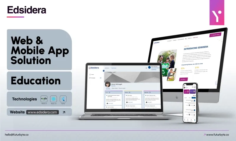
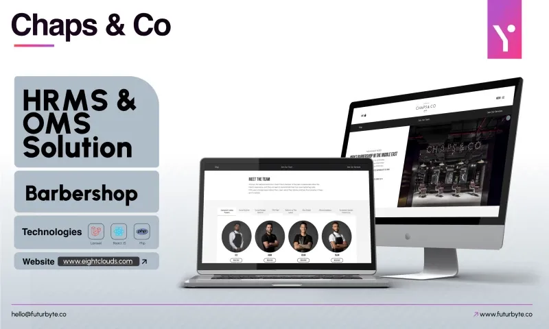
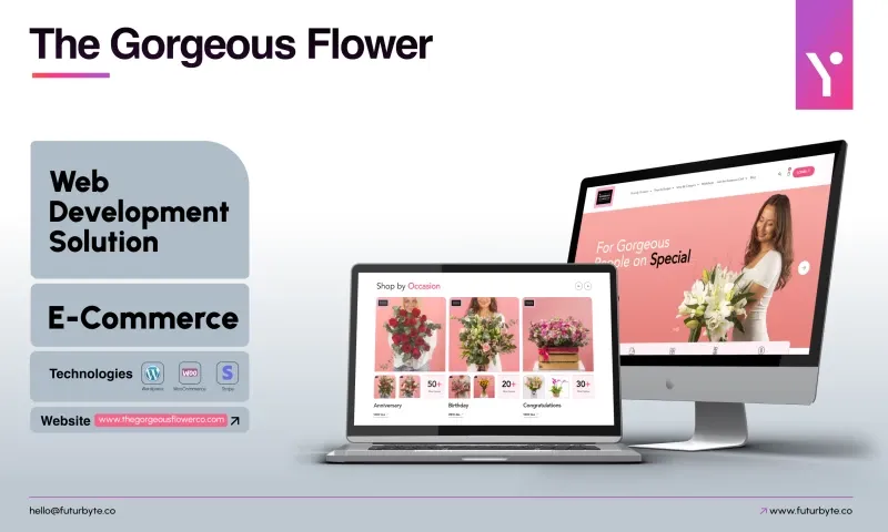
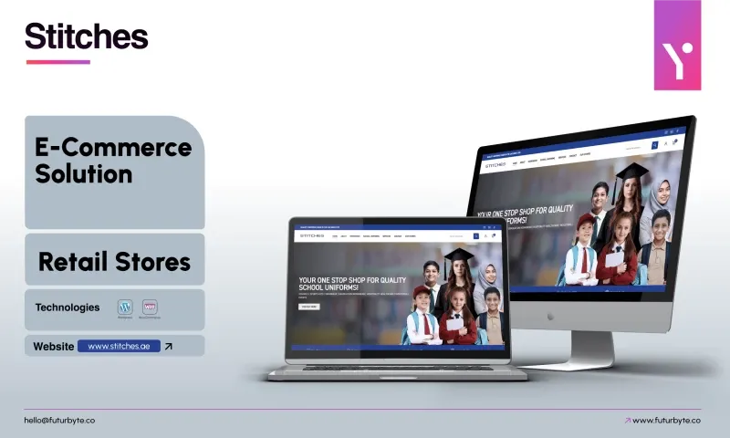
From there we will ask questions, suggest a sensible scope and explain how the project would run. Our clients rate us 4.9 from 23 reviews on Clutch, and the product work on this page shows the range we design. When you are ready, send us a message and tell us what you are building.
 4.9